One Pattern, 120 Years: Adapting Butterick 6093 for Regency, Teens, and 1930s

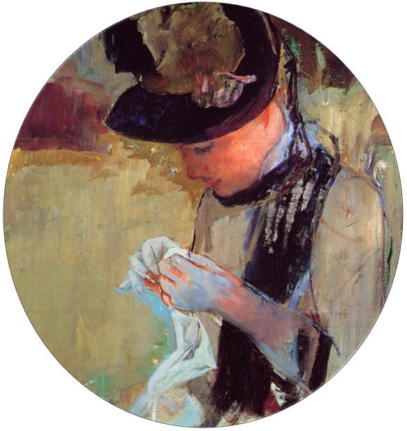
Butterick Patterns has a set of patterns called the Retro line. The Retro patterns skirt (ha ha!) the line between costume and everyday wear: it caters to those looking to revive vintage styles in their daily wardrobe, also known as “historybounding.” Most are 1950s patterns, but they did shock and confuse the non-costuming crowd a few years ago by sliding a few 1910s patterns into the mix, including Butterick 6093, a pattern based on day fashions from 1912.

Now, folks had strong reactions to this pattern when it came out, mostly because the styling of the model was neither modern nor historical, but an odd mishmash. However, it quickly won folks over. I love Butterick 6093! It is a great simple pattern. I’ve already wrote a ton about it, so I’ll spare repeating myself again here, but if you want to read more about the pattern, you can check out my numerous blog posts about it.

I am all about versitility…and sloth. Once I have a pattern down pat, I want to use it over and over instead of having to start over again with another pattern. I made several 1910s versions of Butterick 6093, why not see where else I could take it?

So I rolled the calendar back 100 years from 1910 to 1810(ish) and made a Regency dress!

1910s and Regency fashion have a lot in common on the most basic level: high waistlines and columnar skirts. They have vastly different construction methods, though! Butterick 6093 isn’t historically accurate to Regency or 1910s construction (uh, invisible zipper, anyone?), but when I was invited to a luxurious Regency Valentine’s tea by Laura of Decor to Adore, I decided to see if I could make a Regency dress out of this pattern.

To turn Butterick 6093 into a more Regency-esque shape, I had to alter a few things, mainly the skirt.
1. I used the under-skirt panel from Butterick 6093 for the front, adding length so that it reached the floor instead of my ankles.
2. I left off the overskirt and wrap front pieces.
3. Then, for the back, instead of cutting the fitted skirt back, I added ~24 inches of width and pleated it to the back.
4. I cut a wedge shape out of the back bodice waistline to mimic the high Regency bodice backs popular at the time (plus I’m short-waisted anyway, so it fit much better)
5. Then I trimmed the sleeves with pinked self-fabric trim.

Otherwise, I followed the normal pattern instructions, including the invisible side zipper!

Is it Historically Accurate™? Not in the least! But does it make a flattering, passable dress for a fun day out with friends? Yes!

Becky is wearing a similarly styled dress, but from a more accurate pattern: the cross-bodice dress from the Sense and Sensibility Elegant Lady’s Closet pattern set.

Ah, the winsome pre-Covid days when we all gathered in other folks’ houses for dinner parties!

Just a month later, Lockdown began.

Stuck at home, I should have been in the midst of a creative bonanza! Here I had all the free time in the world– but I had no energy. It was too stressful, watching from windows and wondering what was going to happen. The depression was real. I slugged away in bed most days. But I did have one more idea for Butterick 6093…

I was going to be stuck at home, why not make a house dress? Browsing Pinterest, I stumbled upon some 1930s catalogues and old Lane Bryant ads for house dresses in cute cotton and rayon prints. I had some daisy print cotton I’d bought at Walmart ages ago because it screamed 1930s at me. Now, locked in the house and needing a project, it seemed like the perfect solution to the creative slump.

As you can see, there were plenty of wrap and faux-wrap style house dresses with wide collars to choose from! They looked so much like Butterick 6093, I knew I had to make one last transformation out of it.

To make Butterick 6093 more 1930s-esque:
1. I shortened the skirt and added a kickpleat at the bottom for ease of movement.
2. I lengthened the waist a few inches to put it more at the natural level.

I opted to leave off the faux-wrap skirt pieces, but as you can see in the original ads, you could add one or both and still maintain a 1930s look.

That’s pretty much it!

Sounds simple, right? Well, it is, but in reality, I started this project in Spring of 2020 and I only finished it last week…NEARLY A WHOLE YEAR LATER. I jokingly started calling it my “Depression Dress” because it was from the Depression Era and I was depressed so…ha ha! Dark humor.

I just wasn’t feeling it. I struggled with picking trim for the dress– overwhelmed by possibilities– then stalled out at the hem and zipper completely.

I hung it on my door a while, waiting in its half-finished state.

Then, last week I finally decided to just finish the dang thing! When I grabbed it off its lonesome hook, I discovered it was even more complete than I remembered: really, all it needed was the zipper and the pocket! I waffled a bit on the pocket: without it, the dress was much more flattering, but the crochet pocket is an antique from my grandma, and what more perfect place to use it than on the exact type of dress it was originally made for? (You can see a similar little crochet pocket in one of the ads above)

And thus, nearly a year later, I finally completed my Butterick 6093 1930s house dress!

The yellow glass buttons were a last-minute addition. I found them in the bargain bead bin at Walmart, of all places! They came in a $1 pack mixed in with other random pressed-glass buttons, clearly all made from antique molds.

Butterick 6093 is now, tragically, out of print, so it can only be purchased second hand. If you don’t already own a copy, it is worth investing in! As you can see, it is quite versatile!

This pattern experiment was also a great example of how fabric choice and accessories really affect the final outcome of a pattern. My philosophy is that if you don’t have a perfectly accurate pattern, having an period-plausable fabric and accessories can help make up for it. It also works vice versa: an accurate pattern and fit can transform a less-than-ideal fabric into something more historical looking. Each of these three Butterick 6093 dresses are almost identical in style and are all made of cotton with a side zip (ahistorical for every era but the 1930s dress version, of course!), but the different fabrics enhance the illusion of their representative eras.

Bonnets that Deserve Better: A Dozen Ugly Ducklings in the Met’s Headwear Collection

I love a good bonnet, even if badly photographed. <3

Museum photography has come a long way in the past decade. I remember when the only way to explore a museum’s collection was to physically travel to view an exhibit in person, be buddies with a curator, or read about them in textbooks, sometimes with a blessed-but-grainy black and white picture the size of a domino. Now museums around the world have their collections photographed and available for free online!

We have gone from this:

To this:

Bonnet, circa 1870

Huzzah! Hooray! Oh, happy day!

And believe me, I am infinitely grateful. But, I am also infinitely concerned with systematic forward progression and implementing improved standards of quality (i.e. I am demanding and persnickety). Today, I am picking on the Met because the Met is one of my favorite museums. They seem open and honest about their collections– even candidly blogging about some drawings in their collection were massively mis-attributed! You can even give them feedback about their website, rating it and saying what you liked and what you didn’t. I appreciate their openness and make full use of it. MMoA, you asked for it!

In my many invested hours of research (i.e. PINTEREST), I have discovered many beautiful Met Museum objects with hideous photos, in particular, 19th century bonnets and hats. Granted, there are plenty of hideous objects with lovely pictures as well. There is clearly a miracle-working photographer in the costume department because they made this clunky sunbonnet look so lovely I kind of want it…which is saying something because I LOATHE 19th-century sunbonnets!

Cotton Sunbonnet, circa 1860
This photo makes it look good enough to actually wear!

Now, compare that picture with this one:

Sunbonnet, circa 1838
Ah, there’s the warm, familiar hatred again. If Jedi had to wear sunbonnets, I would instantly become a Sith. No questions! Sunbonnet Crusher duty? SIGN ME UP!

Okay, so maybe I am exaggerating a little. You see, that second bonnet isn’t terrible at all! In fact, it’s actually way more adorable than the photo lets on. It’s made of a spotted calico that’s kind of polka-dotty from a distance, it’s got pinked trim, a nifty straw brim, and a sweet bow perched on top. But that photo just does not do it justice when you compare it to other bonnet photographs in the collection:

Snedden Designer Bonnet with Pearls, circa 1883
(another bonnet that has benefited from the leap in photography technology)

Velvet Evening Bonnet, 1802

Bonnet, circa 1887

“But, Liz! Those are all fashionable, fancy-lady bonnets! You can’t compare a daytime 1850s sunbonnet to a 1880s millioneress’s bonnet!”

True: there are many bonnets of vastly different styles, decades, price-points and occasions, but being fancier doesn’t make them any less likely to be photographed poorly. The Met does not discriminate based on social class! Case in point:

Which of these two photos looks like a million bucks to you?

I started making note of all the bonnets I found that were begging for a better photo. The list was quite long! However, I narrowed it down to just a few.

MOST of the bonnets are this list were not picked just because I thought they needed a prettier photo–though, confession: some are on the list because they are OMGorgeous! There are so many pretty-but-not-artistically-photographed bonnets in the Met’s collection, like this early 19th century bonnet. However, many of them, despite their flash-blasted, yellow-tinged photographs, still shine through with clear detail. Instead, I chose bonnets that I thought were actively hampered by their photo– those with great texture that was lost, fit that was hard to judge, or colors that weren’t properly portrayed, all details that are actively explored and sought after by costume and textile researchers.

THE TOP 10 BONNETS AT THE MET THAT DESERVE BETTER PHOTOS!

#10: “Ye Old Bonnet?!” circa 1799-1810

Originally #10 was this straw bonnet that I loved the shape of, but there is no view of the front. However, I stumbled upon this bonnet/headdress just before publishing my list. I was so intrigued, I knew it had to be on the list! There is no other “bonnet” like it in the Met’s collection and if that date is correct (question: has anyone seen something like this from the era?), it would make it one of the earliest pieces in the bonnet sub-category. I want to know more!

#9: “Happy Spring Day in a Dust Storm” Bonnet, circa 1860

This is one of those “It’s just so pretty it needs to be shown off!” bonnets. The layers of trimmings are so lovely, but the dingy, grainy photo does its richness a great disservice.

#8: “Black Velvet Mystery” Bonnet, circa 1850

This bonnet already has a beautifully lit, crisp new photo, yet, it’s impossible to tell how it fits! It’s listed as a bonnet, but the shape and fit isn’t obvious. Does it perch on the back of the head? Is it a child-sized cap? Or is it bigger than it looks? This is a piece that would really benefit from a display head.

#7: “Snow Princess” Lace Bonnet, circa 1885-90

Another stunner suffering from bad lighting and graininess! This bonnet is mummified in lovely lace, has a velvet edge, and a feather on top! The interplay of textures and true color are lost, though, and the angle of the two photos almost look like two different hats! Click here to see the second photo of the back. You’ll see what I mean. Also, this hat has a photo of the designer’s label, but it’s not listed in the description (J. Pendlebury / Wigan). This was a very expensive hat during its day! It would be so lovely for a bride.

#6: “Scarlet’s Envy” Promenade Bonnet, circa 1851-1862

The vast majority of the Met’s mid-19th century bonnet collection suffers from small, badly-lit photos. I imagine they must have been doing them all in a  swift batch in order to give us, the demanding costuming community, visual references. The Met has worked hard to get photos for every object’s online catalogue page! They are getting closer to achieving that goal. I am so thankful for their hard work. However, this gal is beautiful, but the silk gathers and layers upon layers of delicate trimming aren’t very well portrayed. I also think it’s later in date than listed. Any bonnet experts have a firmer date for it?

#5: “Autumnal Delight” Bonnet, circa 1864-1867

This bonnet is just fabulous! At first I thought that it was a lovely example of straw work, but then I read the description…can you believe this bonnet is made of horsehair?! I would have never guessed!  Once again, the small, grainy photos erase this bonnet’s main draw: the unique materials and lush interplay of textures. Just look at those woven plumes and tiny tassels! This is probably my personal favorite bonnet on the list. I would wear it in a heartbeat.

#4: “The WAT?!” Bonnet, circa 1800-1925

I’m calling this one that “WAT?!” bonnet not because I find it poorly designed (though the display certainly makes it look odd), but because it is in desperate need of a cleaning, some context, and a more accurate date. 125 YEARS, MET?! REALLY?! This bonnet/hat is from around 1900 and would have been paired with a Gibson Girl hairstyle, hence the shallow back (to fit around a chignon) and large forward swoop (to go over the puffy pompadour front). It even has a designer label inside that they photographed, but the cataloger failed to note in the description. It’s not a show-stopping hat by any means, but it certainly deserves better basic cataloguing in addition to a fresh photo!

#3: “Cinderella” Bonnet/Cap, circa 1845-50

Just look at that lace and ribbon! Wow! Even in that terrible lighting, it looks amazing. However, the image is small and grainy, so you can’t see all the wonderful details. This one is just too pretty not to have a better photo!

#2: “Faceplant” Poke Bonnet, circa 1840-69

This bonnet is so sad! It looks like a jellyfish washed up on the shore or a snail trying to crawl away. I suppose if you were a nice “Sunday’s best” bonnet that got labelled as a poke bonnet, you’d be sad, too. This bonnet would be so much happier if its beautiful silk satin shirring and lace were properly photographed on a stand or mannequin!

#1: “Moping Mop” Ribbon Bonnet, circa 1841

The last bonnet  looked sad, but this poor bonnet is actively trying to hide. Perhaps it’s in such poor shape that this is the only way to display it (like this crumbling 1830s straw bonnet), but it’s completely impossible to tell that it’s even a cap/bonnet. What’s even odder is that unlike many of the bonnets in the collection which suffer from dating swathes that range from a generalized 20 year period to the egregious 125 YEAR RANGE OMG MET WTF, this bonnet has been dated precisely to 1841. In addition, it was purchased with donation money in 1982, apparently by choice. Either it was part of a lot that had other pieces in it the Met wanted and the cap just came with, or they purposefully bought it, possibly with provenance granting it such a firm date, like a letter or label. And yet, here it is, just flopped on a table like a mound of seaweed.

The more I looked at these bonnets with less-than-ideal photos, the more I realized how shallow and callous it was to judge a bonnet by its photo. In our massively visual online culture, objects with the prettiest images often get sharing priority, meaning that many perfectly fabulous fashions get ignored! This affects not only personal research, but can affect the quality of conservation, too. Many objects that receive well-made professional photographs often receive special cleaning and repairs in order for them to display and photograph to the object’s best advantage. In a collection like the Met’s–with over 300+ bonnets alone– such a large undertaking would involve not only lots of time, equipment, and effort from the photographer(s), but a large investment from the conservation department– and let’s face it: we may love bonnets, but there are probably more pressing conservation projects than cleaning a common straw sunbonnet, no matter how cute it is.

Interested in seeing more awesome bonnets with horrific pictures?
Click here to view the Met’s bonnet collection online

Let me know which one is your favorite! Is it a delicate straw bonnet from the 1840s? A sky-high feathered stunner from the 1880s? A tubular Regency poke bonnet? Post a link below so I can see it!